SurveyMonkey Response Quality
Streamlining data cleaning for better insights
Date
2021-2022
POOR RESPONSES AFFECT SURVEY INSIGHTS
The ultimate goal of any survey creator is to collect the most accurate insights from survey responses and use these insights to inform the best possible decisions. The quality of the responses in a survey directly impacts the quality of the insights collected, and poor quality responses can diminish and compromise the insights of a survey study. This is particularly relevant for users that run multiple studies, often at the same time, such as academic or market researchers. Thousands of people use SurveyMonkey every day, looking for insights they can turn into action. So offering our users high-quality responses is something we genuinely care about. We understood that if we could find a way to improve the quality of the responses in our surveys, we would be able to offer better insights to our customers. That would ultimately result in customers trusting and valuing our product even more.
DATA CLEANING IS A COMPLICATED TASK
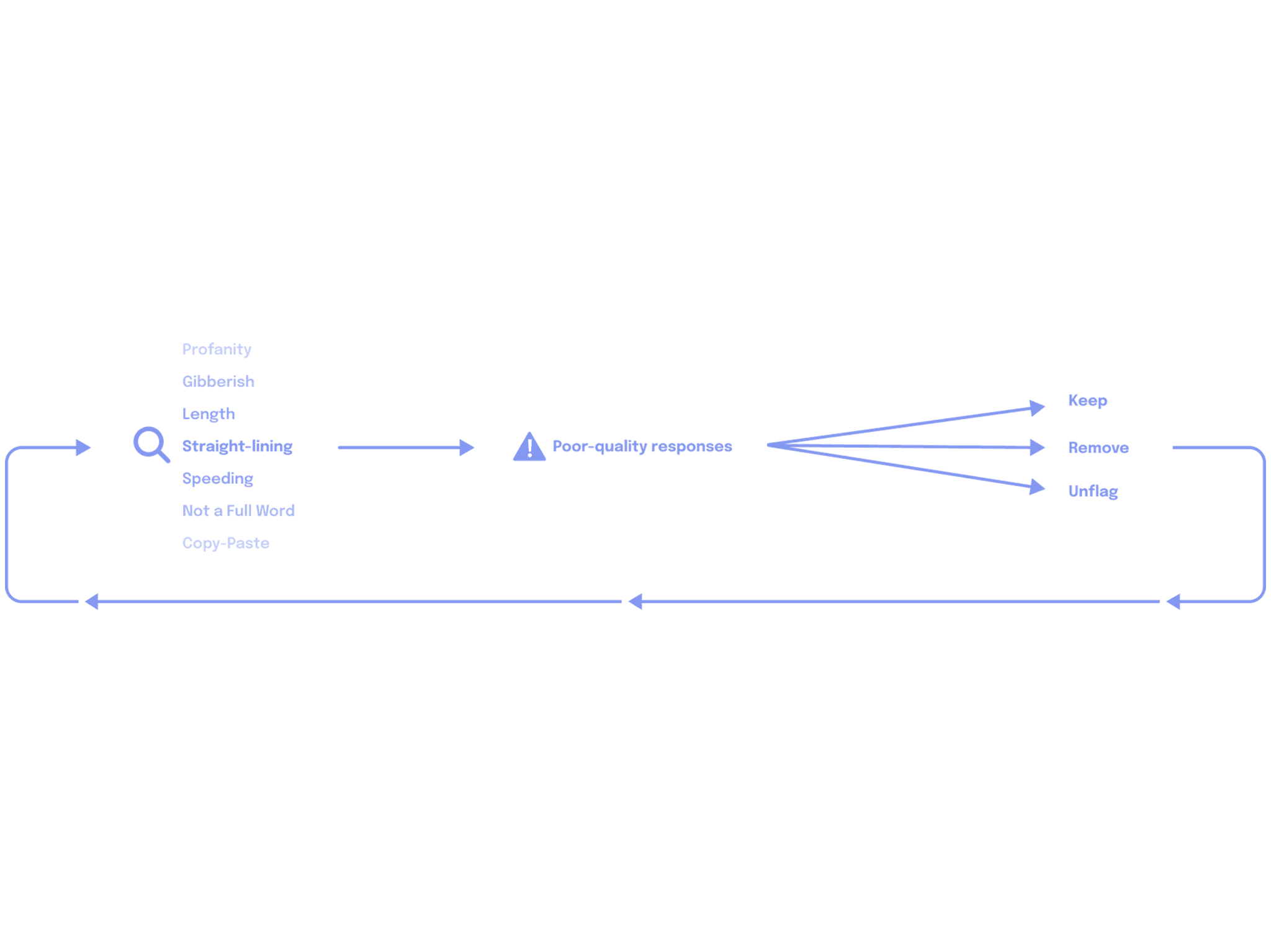
Before users can analyze survey responses and uncover valuable insights, data cleaning is a must. It helps ensure that survey creators will only spend time analyzing responses that are relevant and accurate—so they can go forth and make data-driven business decisions with confidence. Data cleaning involves identifying and eliminating any responses that are poor quality or don’t reflect the target audience. It’s a best practice for any survey project. What we learned from our initial research is that, despite being a really important step, many survey creators find the cleaning process time-consuming and subjective, and up to 70% skip it altogether. So, to improve the quality of responses and help people gather valuable insights, we needed to make data cleaning simple for survey creators.
SIMPLIFYING THE DATA CLEANING PROCESS
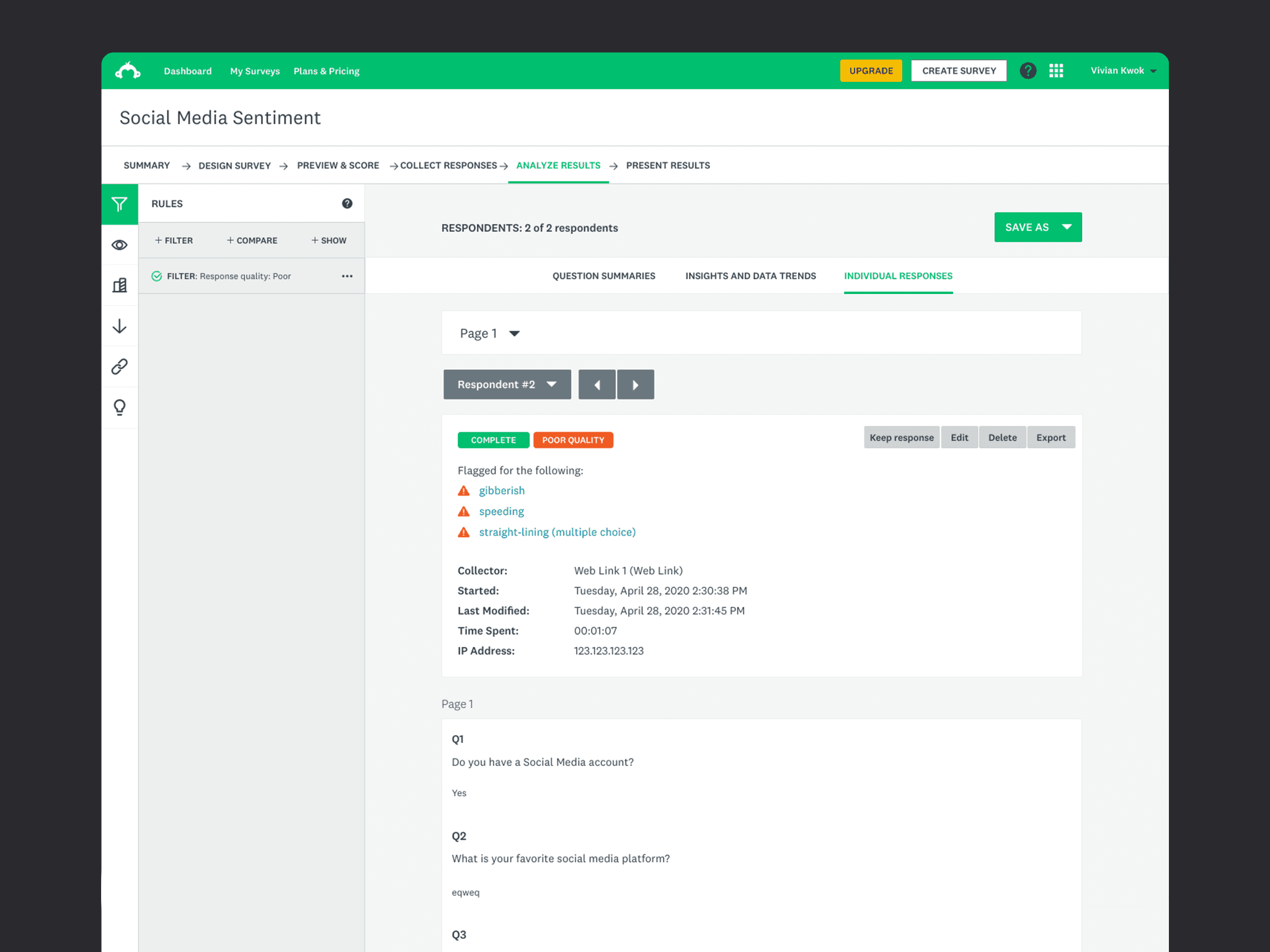
At this point in the project, the team raised some concerns about building the review mode. Engineers were preparing to migrate some of these pages, and we didn't want to increase technical debt. After brainstorming with engineers, we decided to leverage Result Filtering to surface poor-quality responses to users instead of creating a Review Mode. When the users click "Review Now" after being notified about potential poor-quality responses, they would be directed to the "individual responses tab," where results would automatic filtered to only show those responses marked as poor-quality. Filtering responses is one of the most frequent tasks performed when analyzing survey data. So we expected it would feel familiar to them once they saw this new filter applied. For engineers, creating automatic filters was much easier and less risky. It also gave us the advantage to leverage some of the existing UI patterns and components.
EXPLORING THE REVIEW MODE
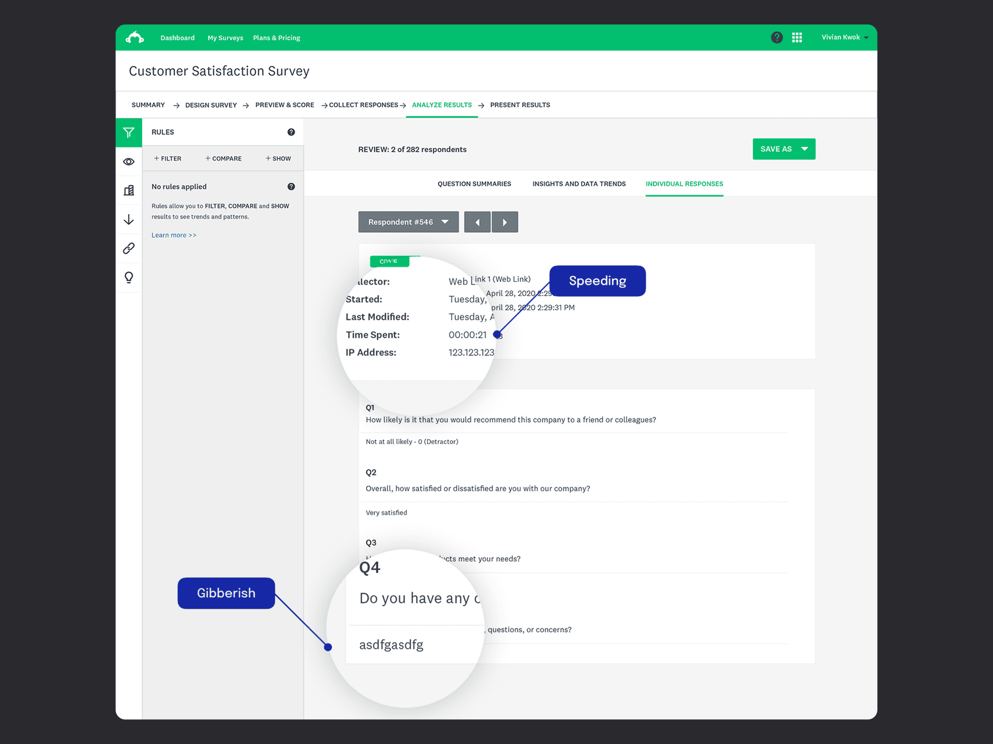
In my initial explorations, the review mode was a sheet that would slide up from the bottom of the screen. The sheet would have a top area identifying the respondent, the poor-quality flags and the buttons to keep or remove the response.This approach intended to get the users in a linear flow and induce them to stay in that mode until they reviewed all poor-quality responses. One concern that we had specifically about the sheet is that it could feel a little bit intrusive for the users. Knowing that users think data cleaning is time-consuming, forcing them into this flow could have the opposite results. So, then I started exploring moving from the sheet into the Individual Responses tab. The advantage of this idea is that it is closer to what users already use to see when they analyze the results of their surveys.
USING FILTERS TO SURFACE POOR-QUALITY RESPONSES
At this point in the project, the team raised some concerns about building the review mode. Engineers were preparing to migrate some of these pages, and we didn't want to increase technical debt. After brainstorming with engineers, we decided to leverage Result Filtering to surface poor-quality responses to users instead of creating a Review Mode. When the users click "Review Now" after being notified about potential poor-quality responses, they would be directed to the "individual responses tab," where results would automatic filtered to only show those responses marked as poor-quality. Filtering responses is one of the most frequent tasks performed when analyzing survey data. So we expected it would feel familiar to them once they saw this new filter applied. For engineers, creating automatic filters was much easier and less risky. It also gave us the advantage to leverage some of the existing UI patterns and components.
CONTENT STRATEGY EXPLORATIONS
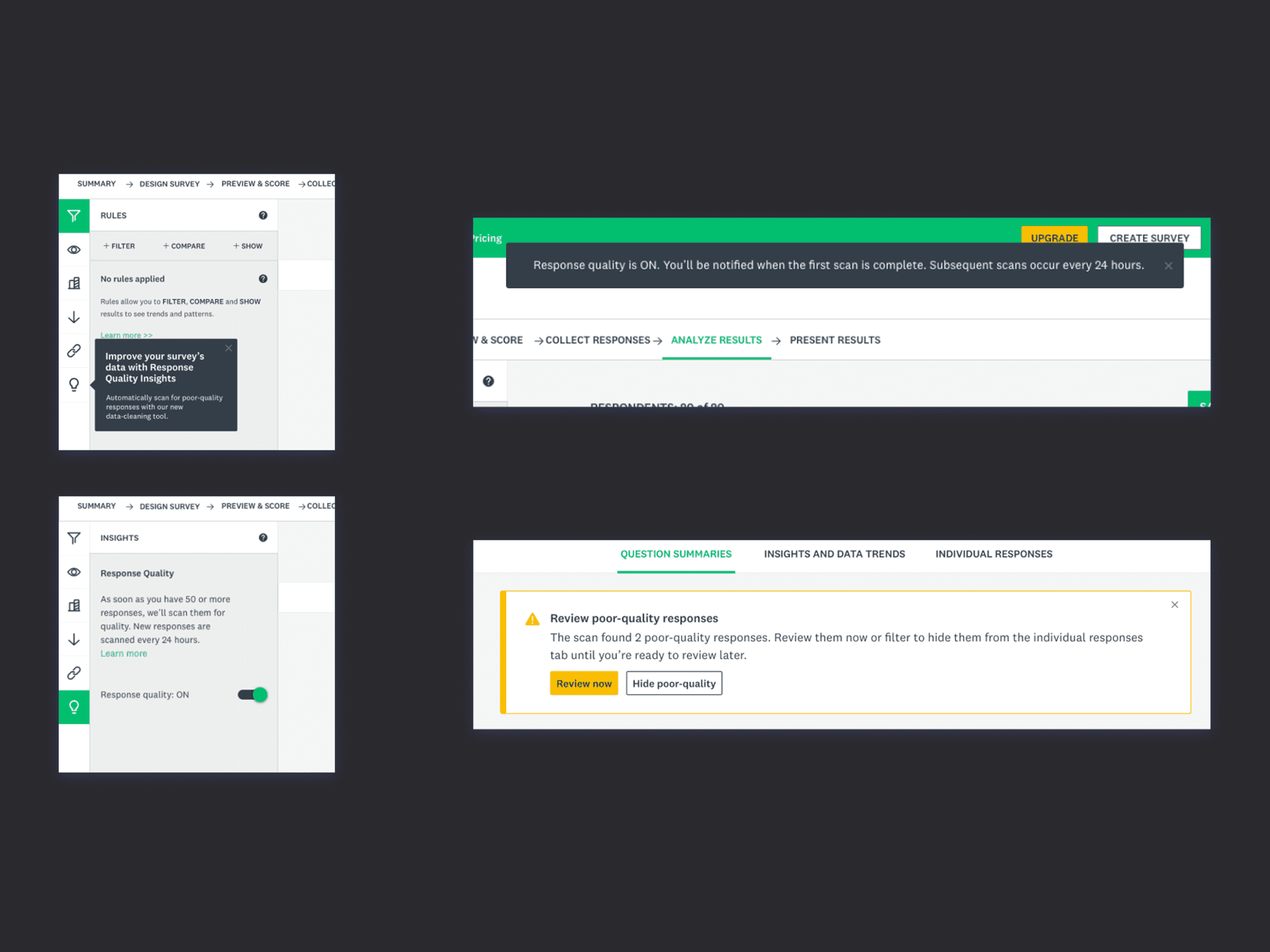
Another critical aspect of the solution was communicating to users the several stages of the Response Analysis scanning cycle. Specifically, we need to tell users when the feature is enabled/disabled, when the criteria for scanning haven't been met, when scanning the responses is in progress but hasn't returned any result, and when the scanning is completed and some responses need attention. The challenge in this exploration was to find the right balance of how often to communicate with users and the appropriate voice and tone to use. We didn't want the feature to be nagging users so much that they would turn it off. Initially, working with a content strategist, I explored using a playful language and the use of some custom illustrations to alleviate user's perception that data cleaning is hard work. But we were concerned that this communication style could be perceived as patronizing or even dismissive of the importance of this task. In the end, we decided to stick to the standard banners we had in our design system instead of the custom ones with illustrations.The language was simple, informative and direct instead of informal and fun. In terms of frequency, we decided to notify users once when they turn the feature on and then only when the scan flagged any responses.
PROTOTYPE TESTING AND USER FEEDBACK
With these decisions made, I put together a prototype and tested it with a small group of users. Overall, the tests were successful. Participants could navigate through the flow and understand and explain the scanning process. Most participants described the feature as useful and said they could see themselves using it. Some of the key learnings from these tests were that most participants wanted to be notified every time the tool completed the scanning, even when no poor-quality responses were found. Participants wanted to understand the criteria for flagging responses and have control over it before enabling the feature. For example, participants wanted to choose to scan for gibberish but not for straight-lining. Lastly, some participants wanted to see the definition of the flag criteria when reviewing the responses.
BUSINESS IMPACT AND FUTURE IMPROVEMENTS


